Hart Home
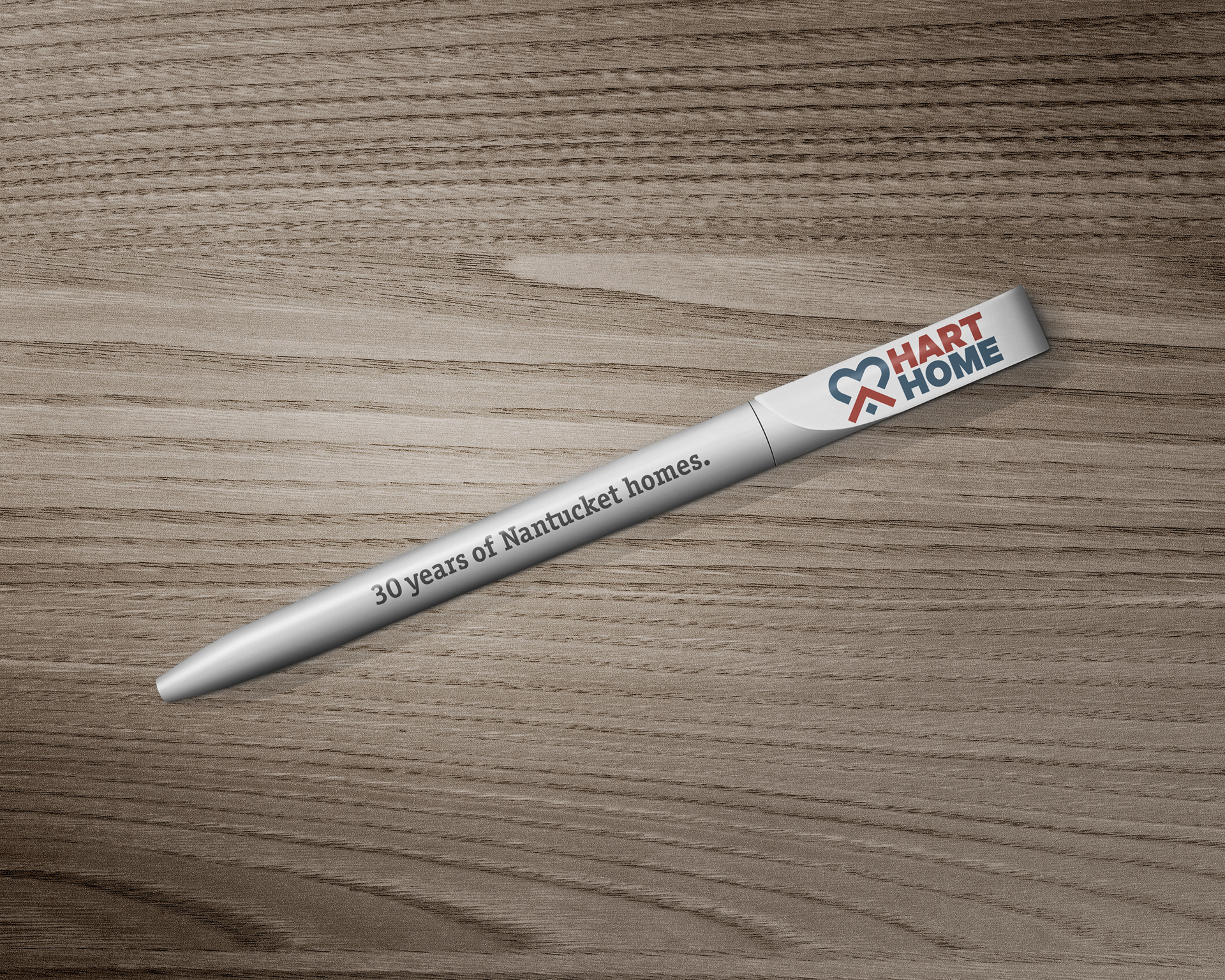
Aetoric Design was approached by a home builder and repairman who had been servicing the island of Nantucket for almost 30 years. Through a series of brand strategy and business development exercises, we discovered that he could develop more consistent revenue and clients by expanding their property management service. In order to do this, we repositioned their identity from one man's name to a fully-fledged brand.
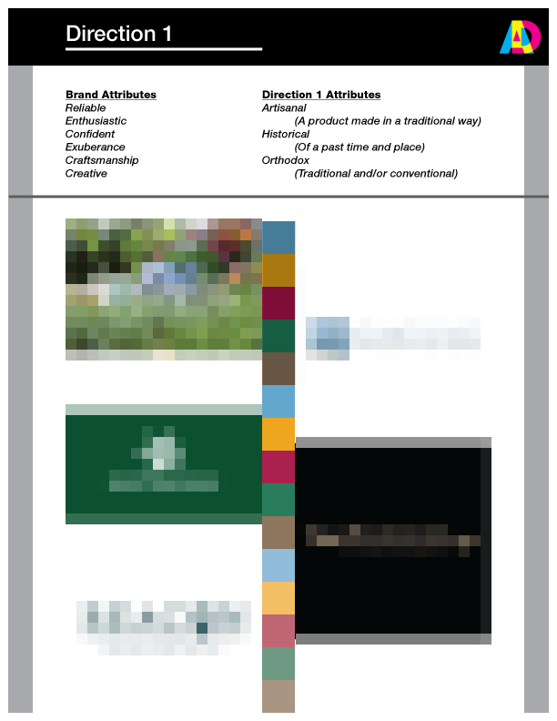

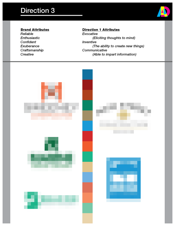
We compiled three visual directions derived from an analysis of local competitors' branding under the context established in our exercises. Using these documents, a discussion took place in which a consensus was reached on the style of the brand identity.
*Images above obscured to preserve the rights of their respective artists.
Through this process, we went from "(First & Last Name) Construction" to...
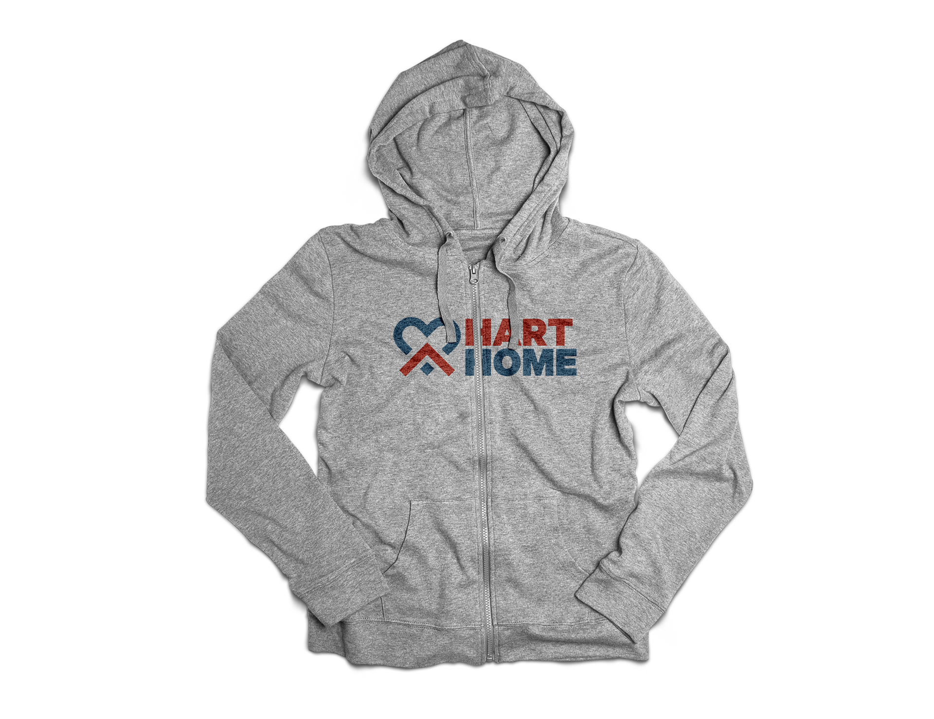
HART HOME
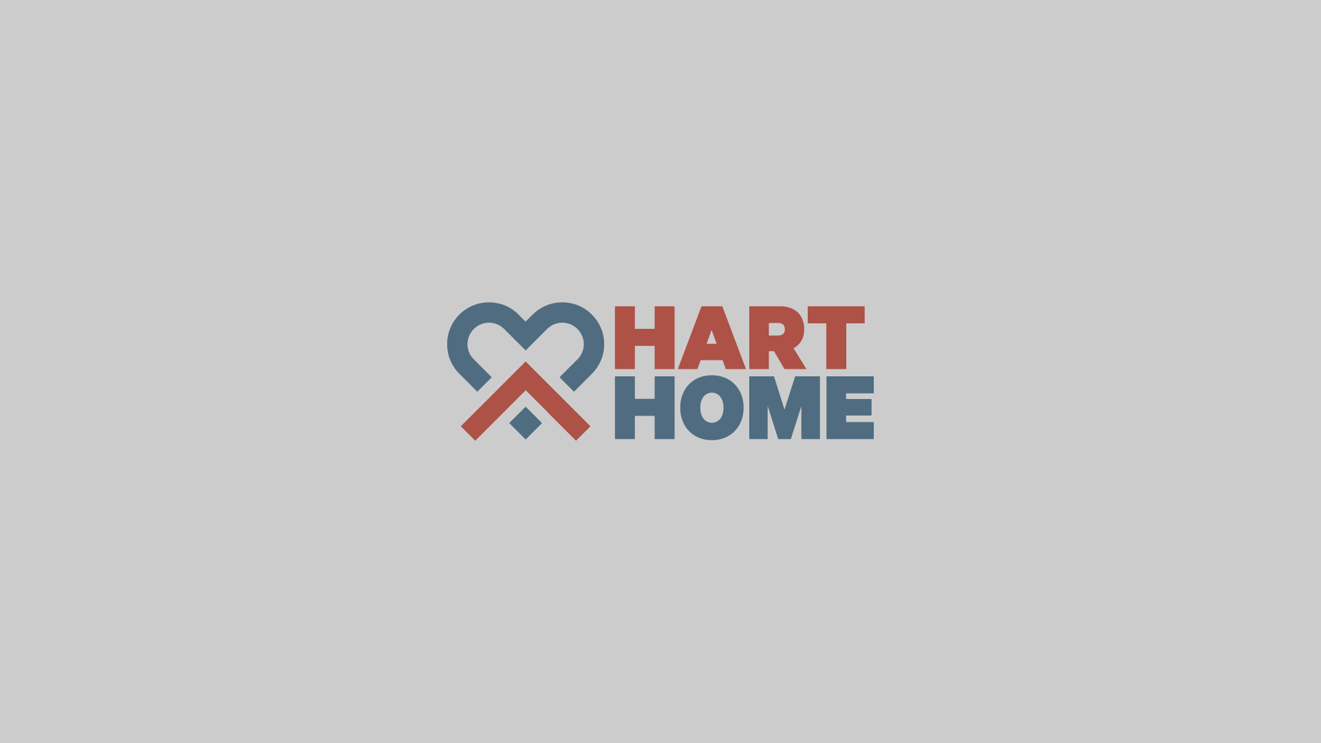
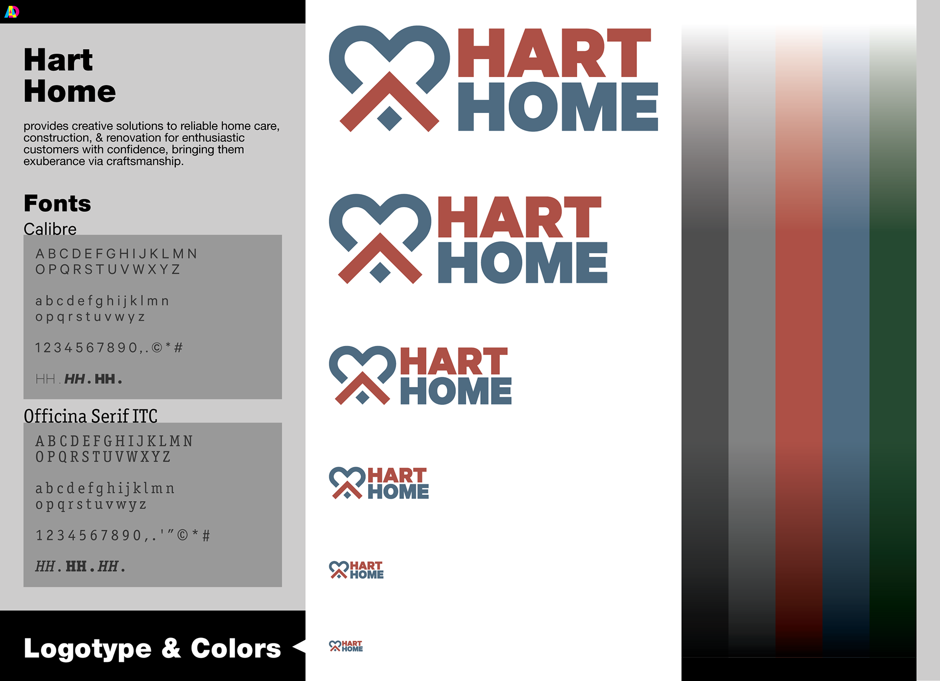
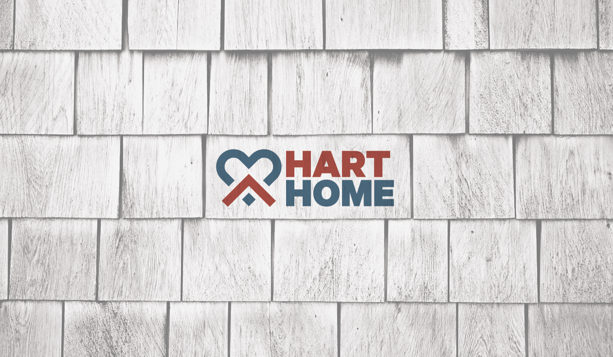
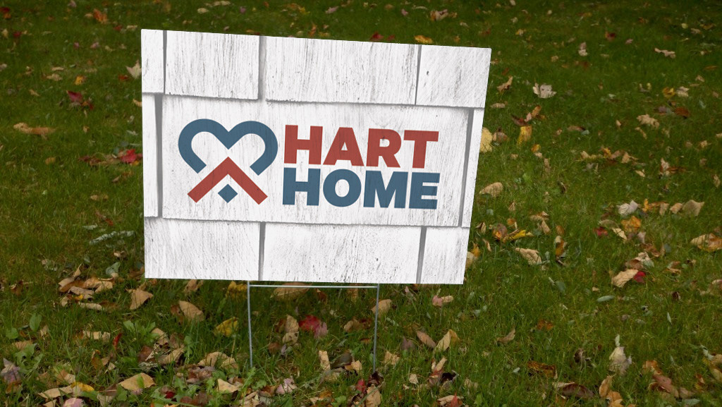
Drawing inspiration from Nantucket itself, we used grays found on the weatherworn shingles that line the majority of the homes on the island in the branding.
But why stop there?


Thanks for looking.