Fiberific
We were approached by an Australian yarncraft producer and distributor who was looking to freshen up their branding in order to deal with printing issues that their old logo was giving them.
Through a series of brand strategy and business development exercises, we also discovered a need to adopt a look that would better establish trust between Fiberific and potential customers with a sense of professionalism while still appearing fun.
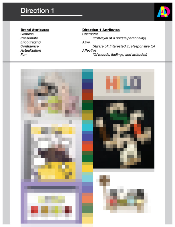
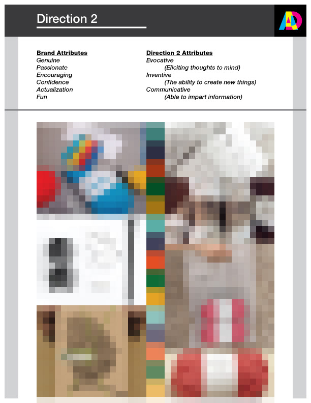
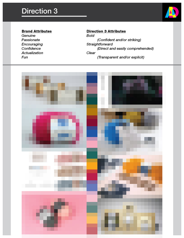
We compiled three visual directions derived from an analysis of other yarncraft brands under the context established in our exercises. Using these documents, a discussion took place in which a consensus was reached on the style of the brand identity.
*Images above obscured to preserve the rights of their respective artists.
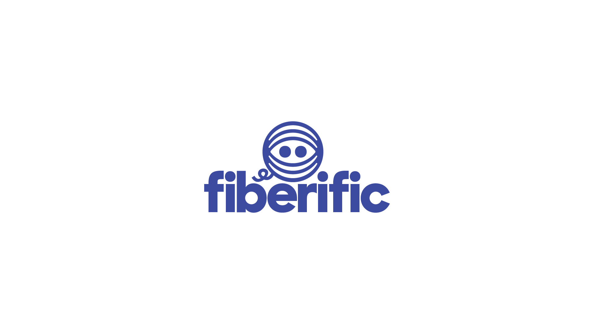
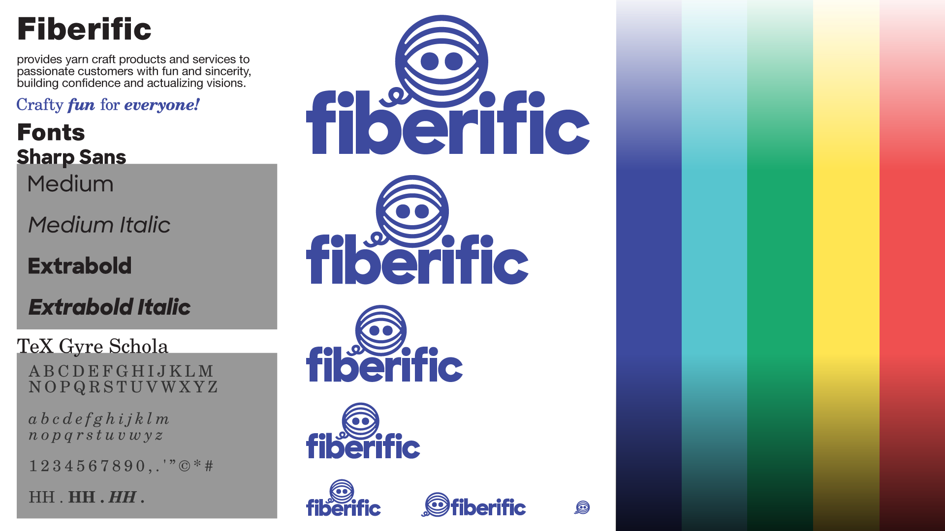
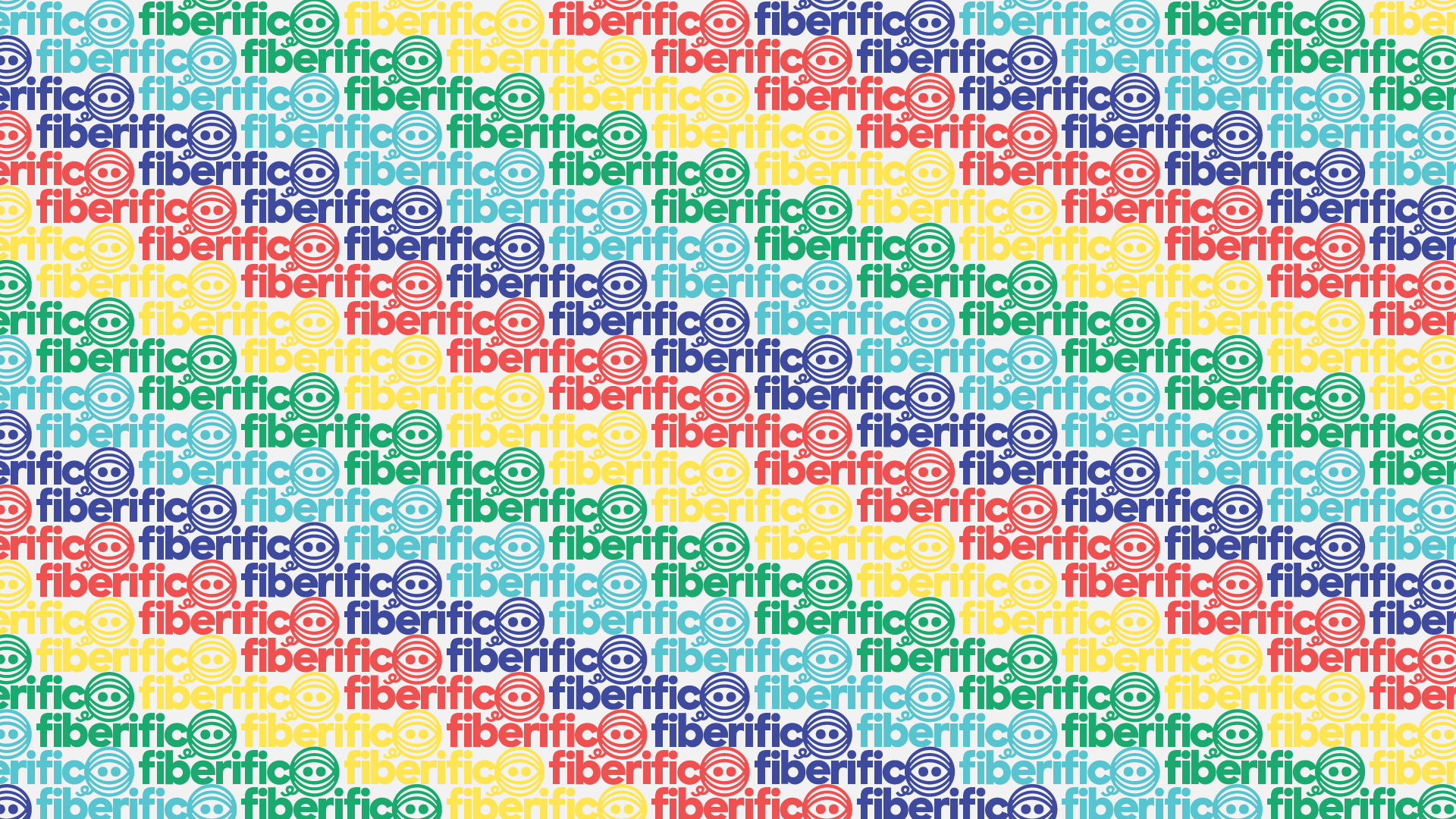
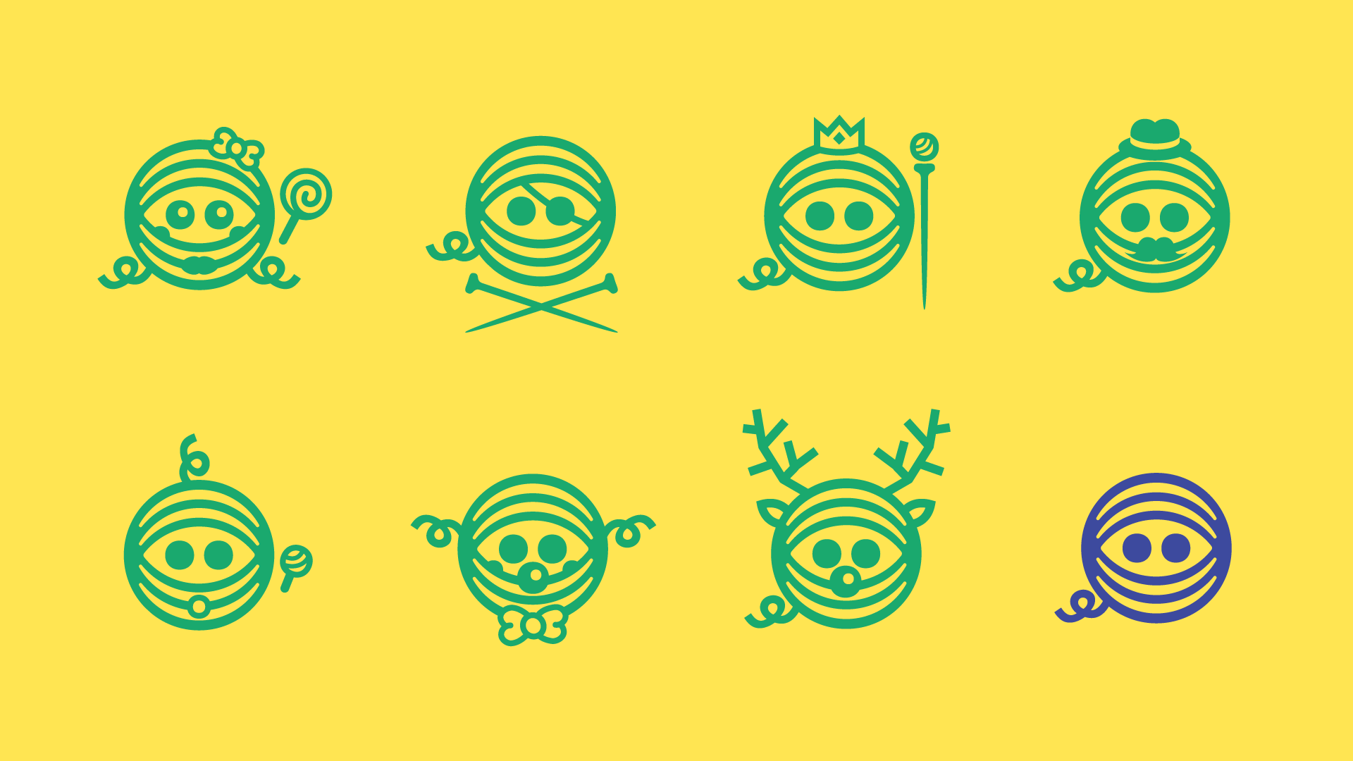
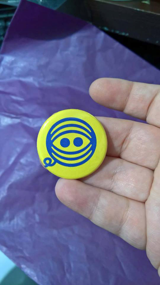
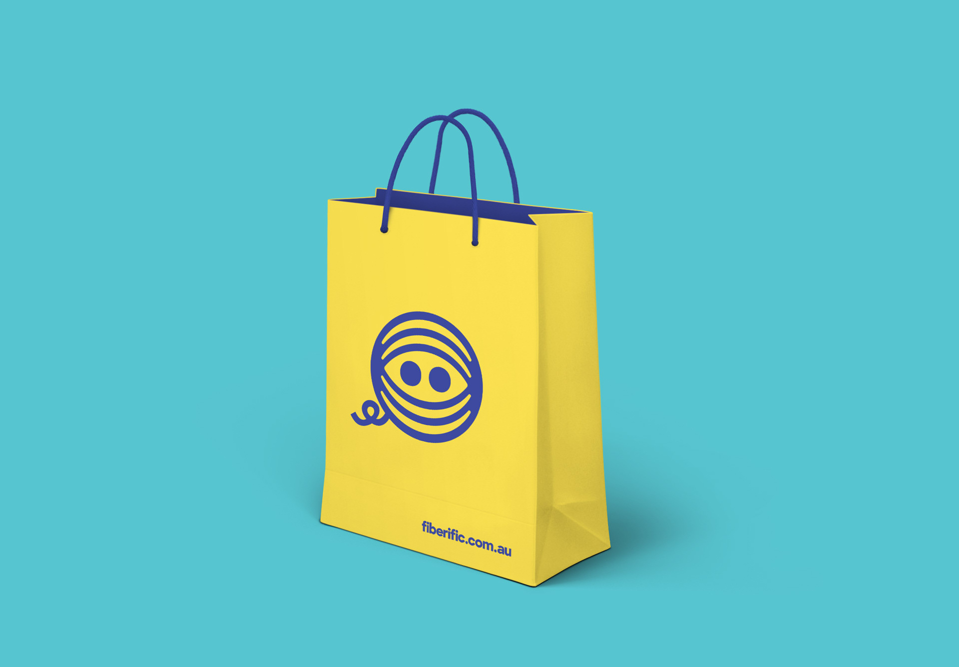
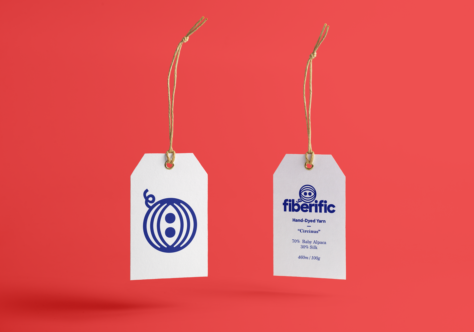
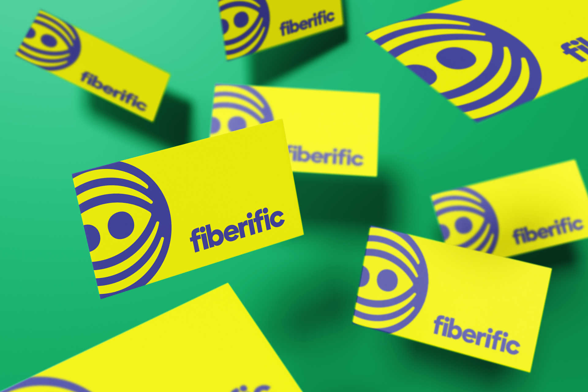
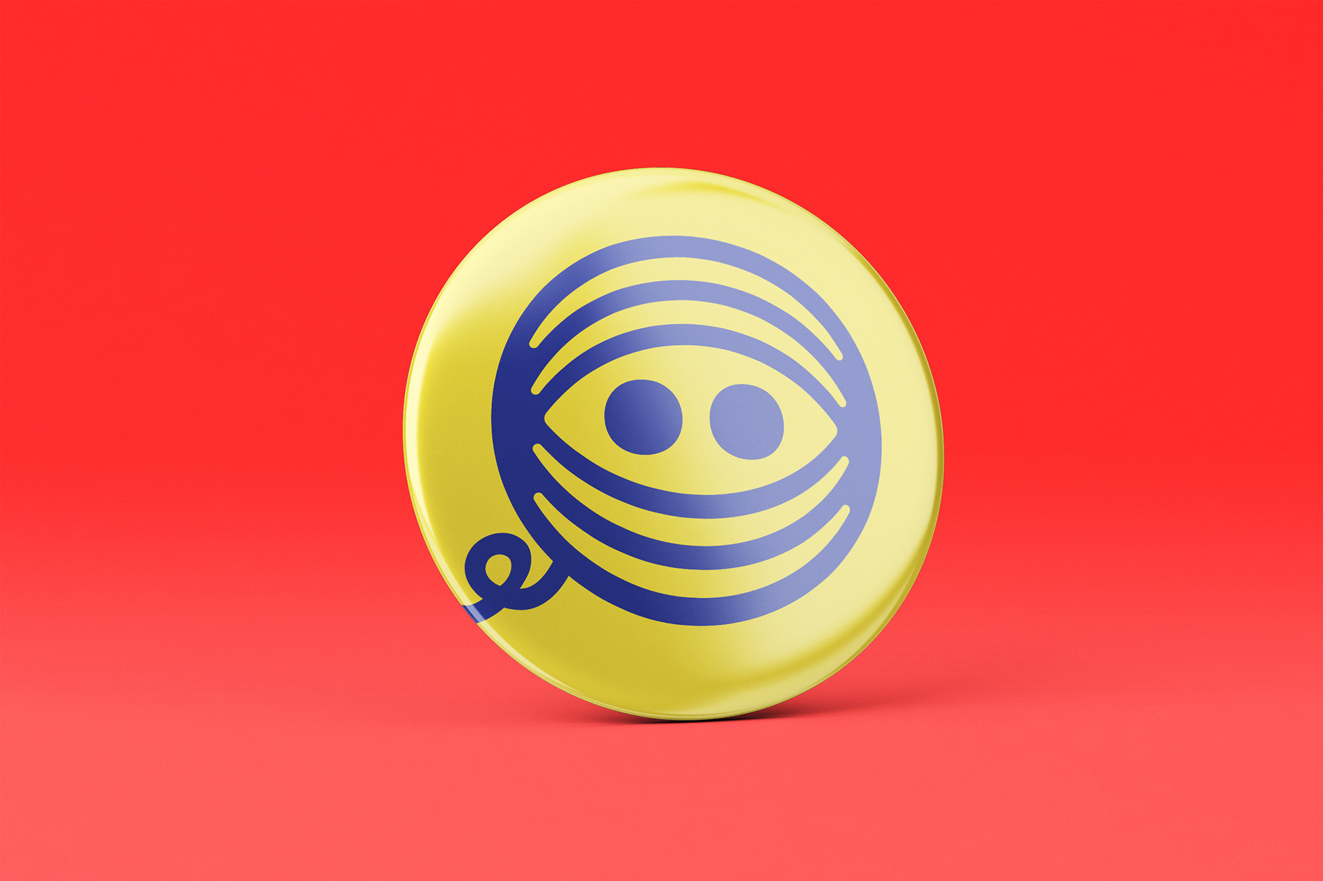
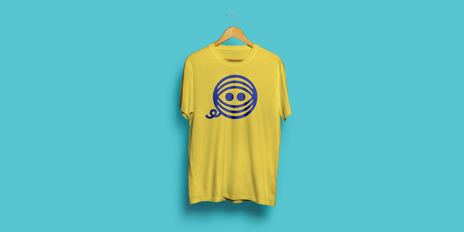
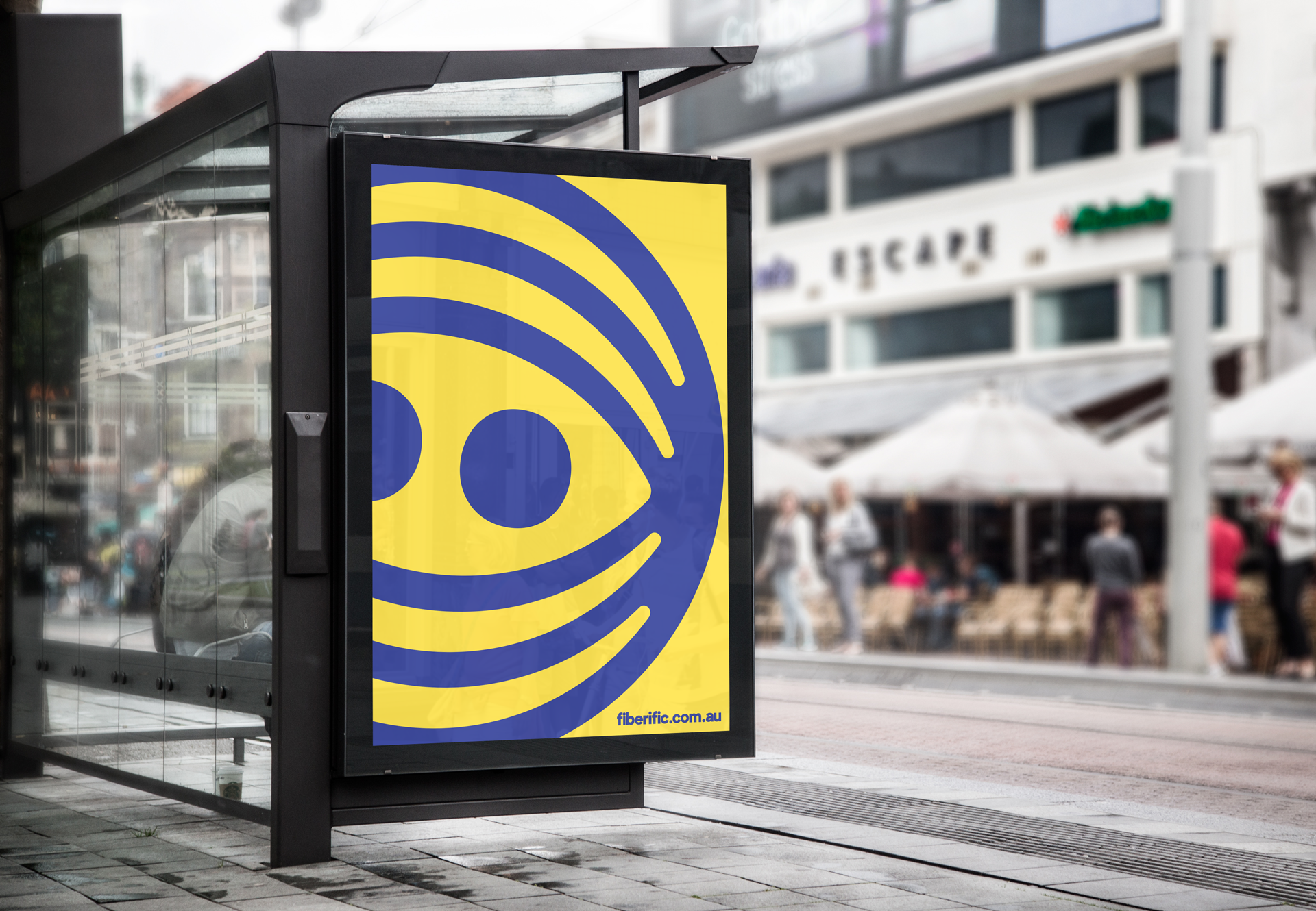
This little ball of yarn accompanied by hand-picked colors and typefaces, create a system that can easily be manipulated to fit a variety of business needs.
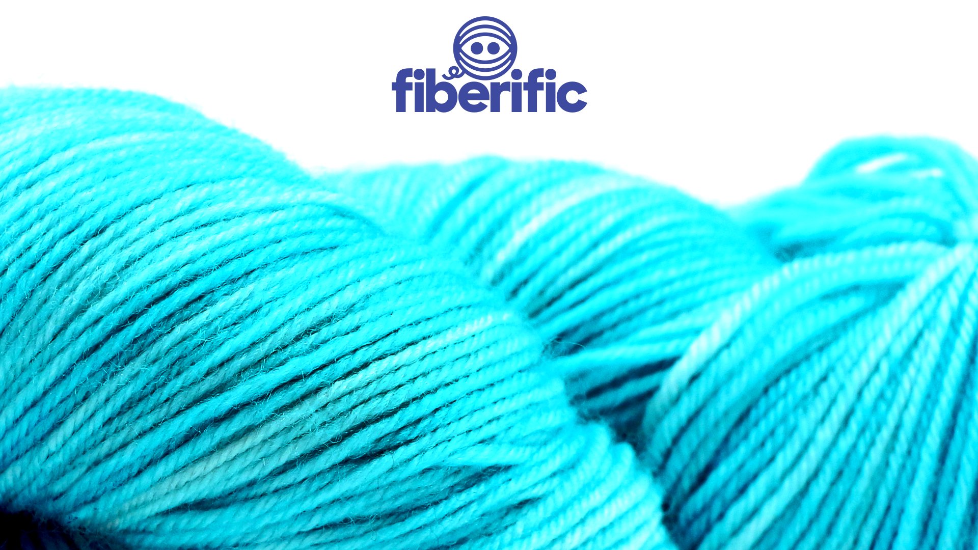
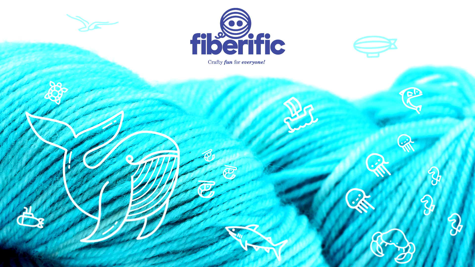
The yarn ball logo, itself, is designed to be easily manipulated with "costumes" in order to take on a large variety of characters, appropriate for any situation. This aligns with Fiberific's products, as they facilitate similarly creative usage of the products they provide.
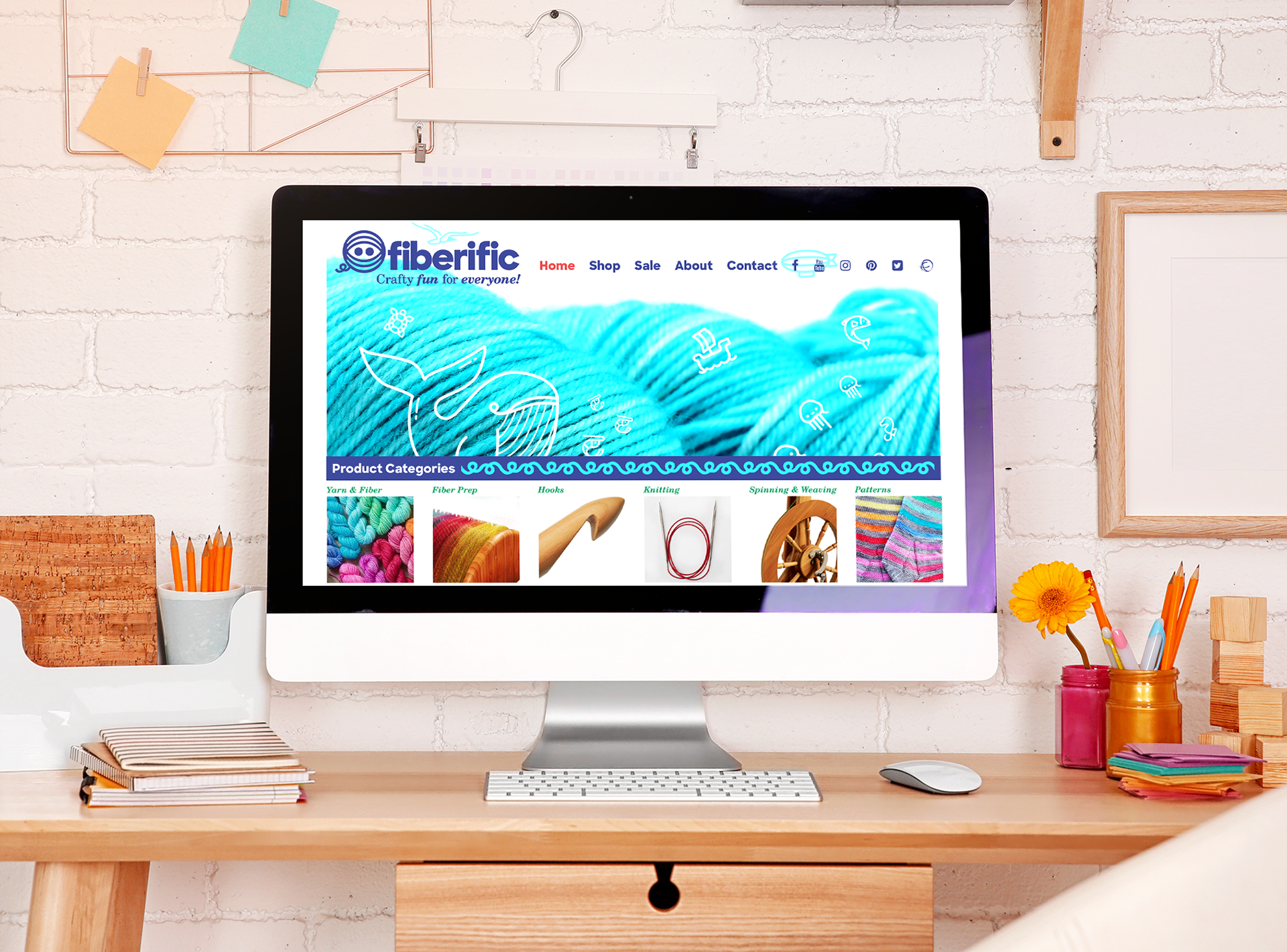
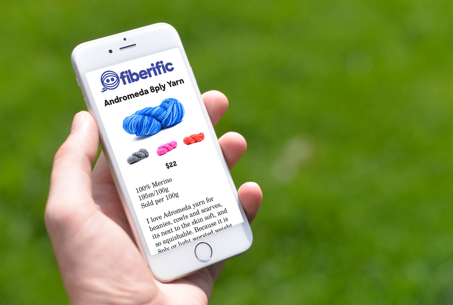
From here, the process of creating branded merchandise, packaging, and advertisements is streamlined and beautiful.
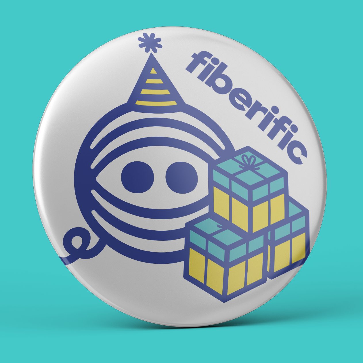

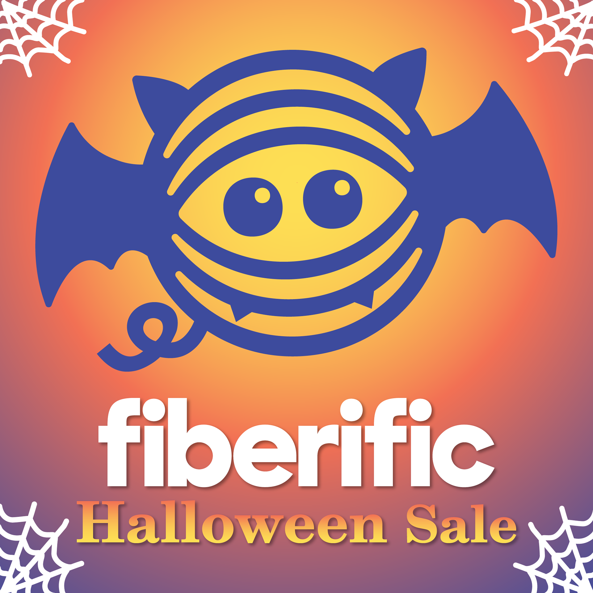
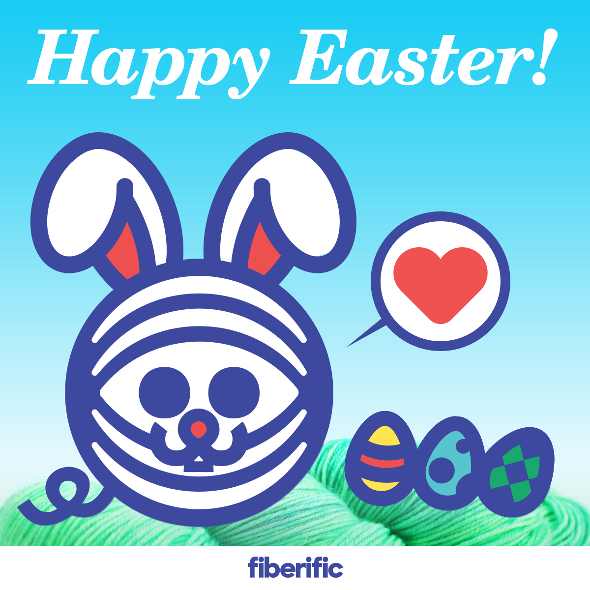
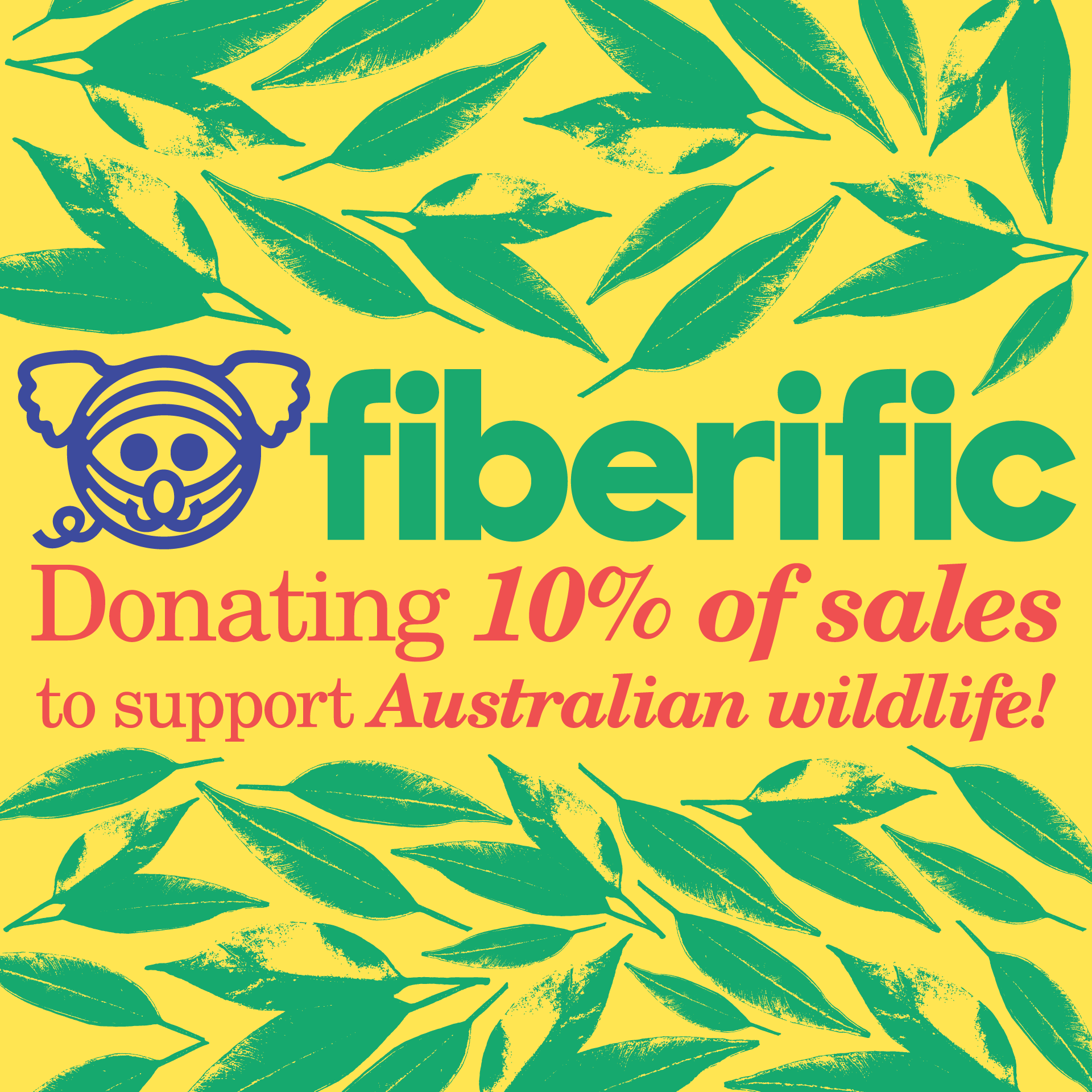
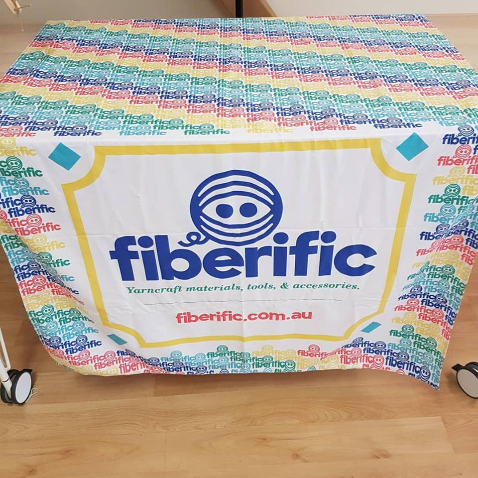
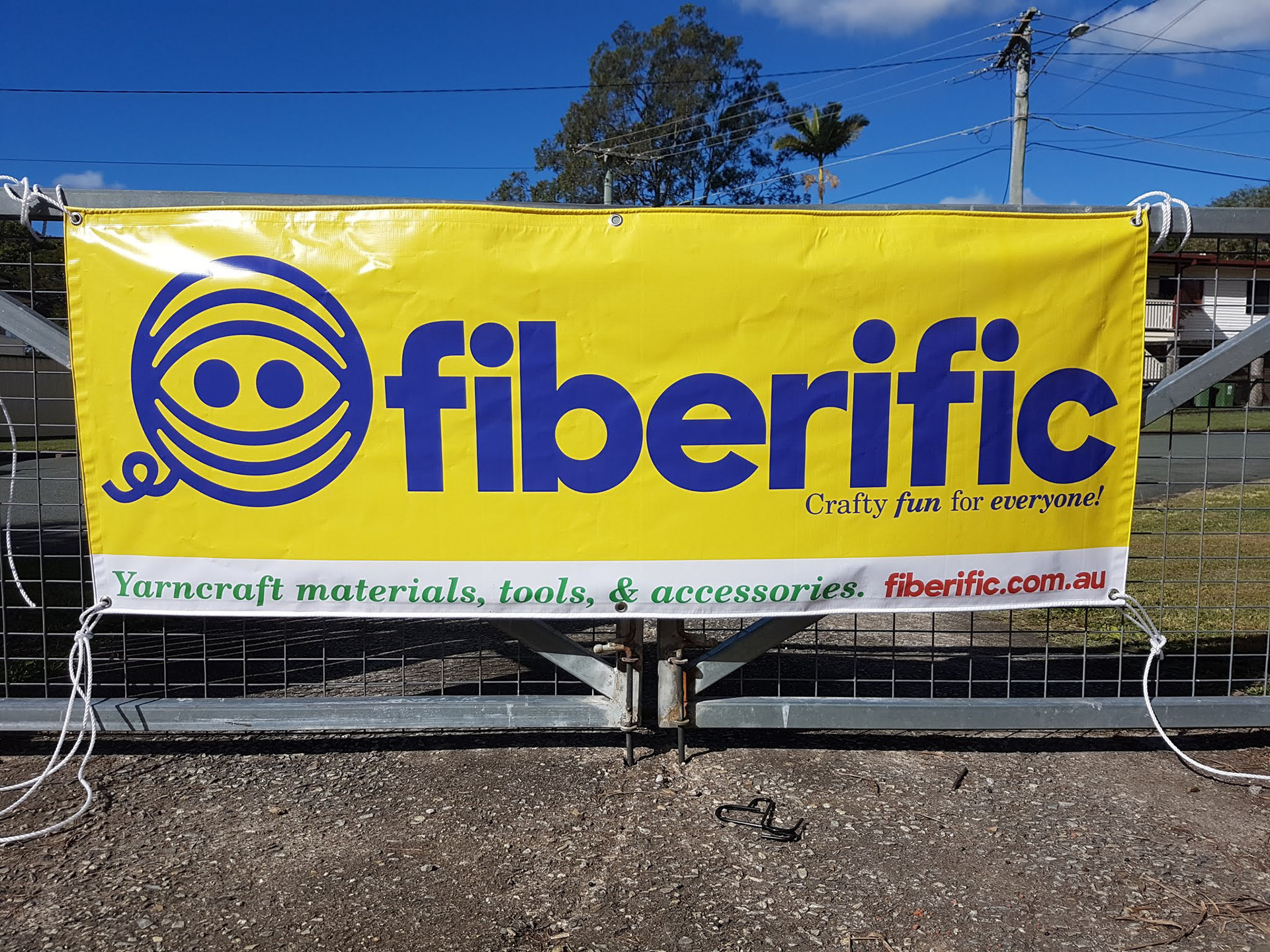
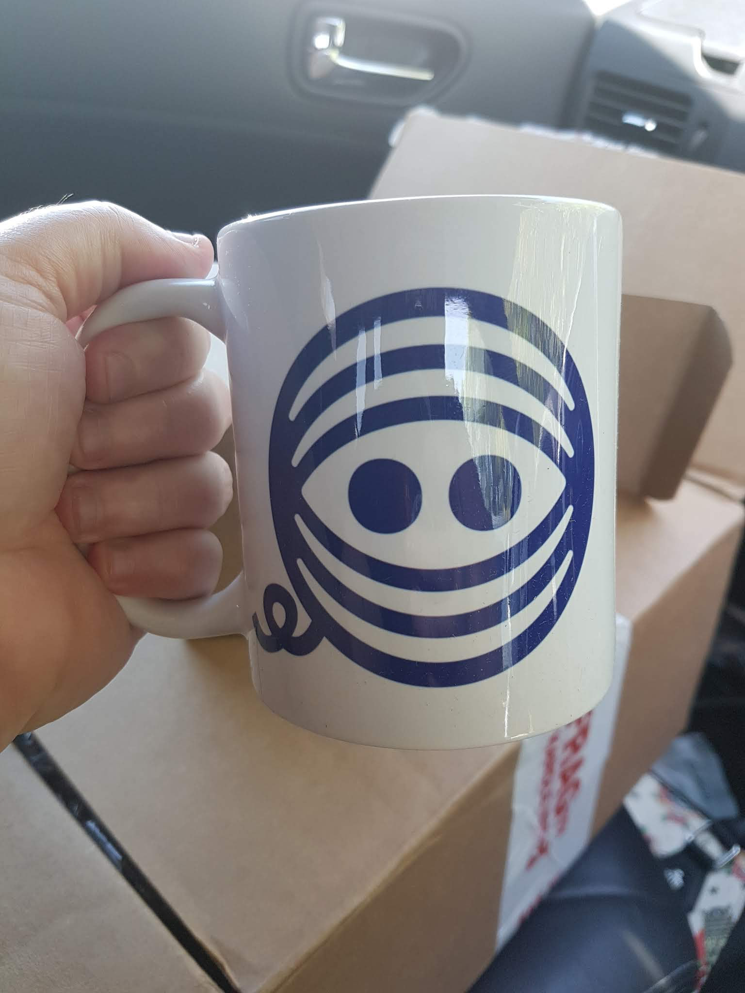
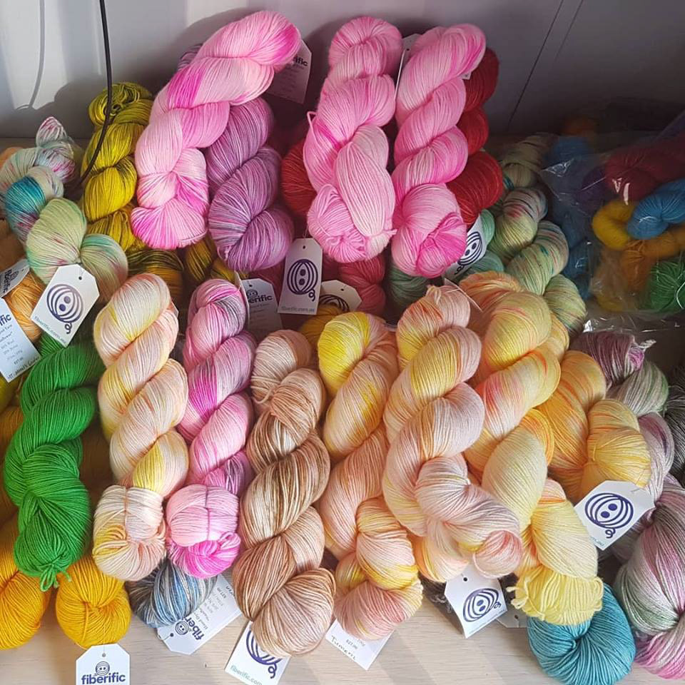
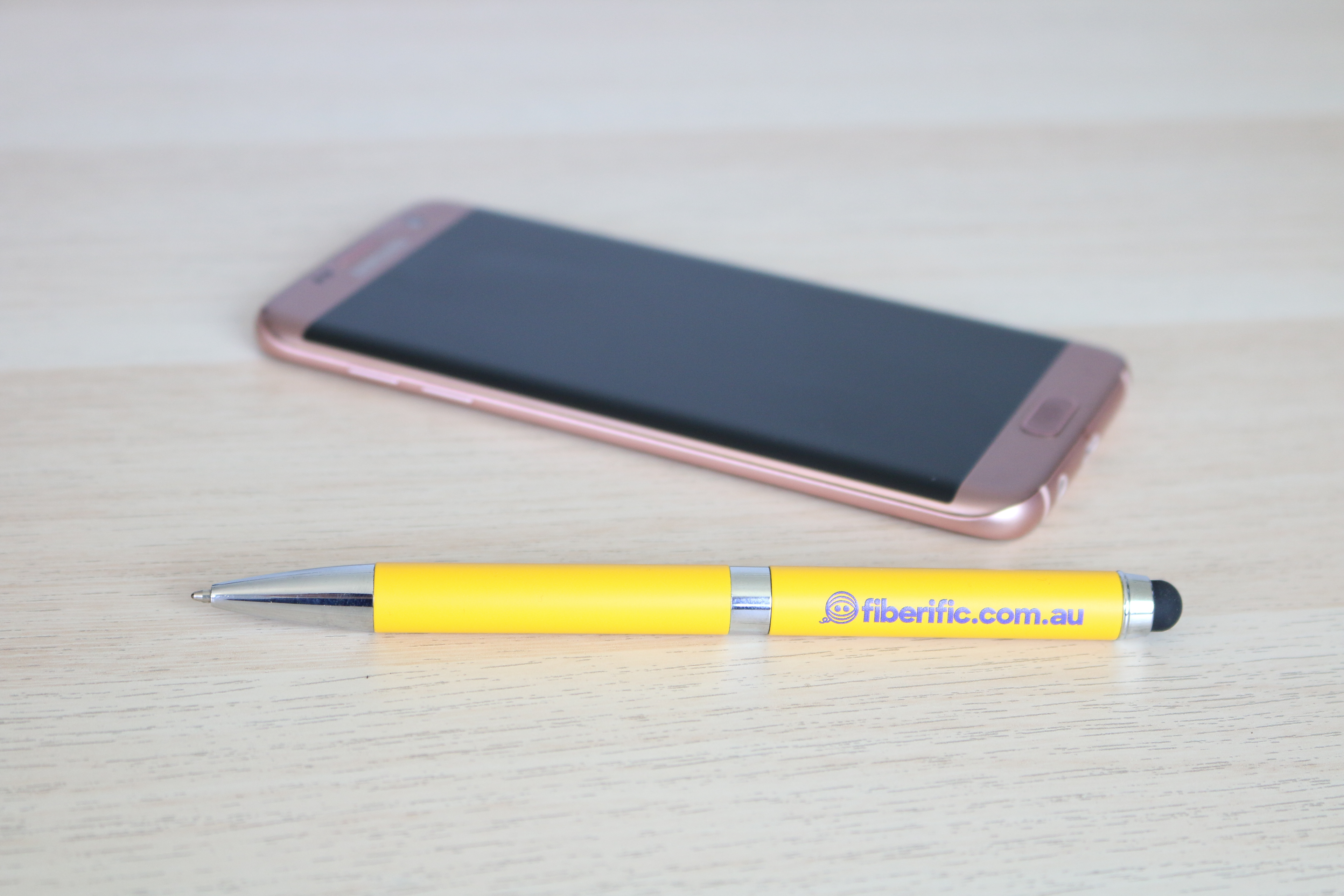
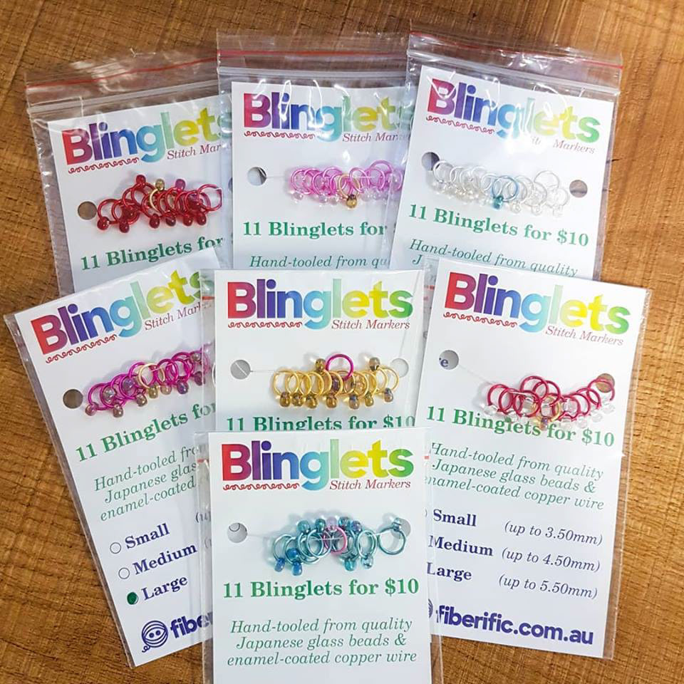
We also created a great deal of printed materials for Fiberific from labels, to signage, to packaging, to goodies, and more.
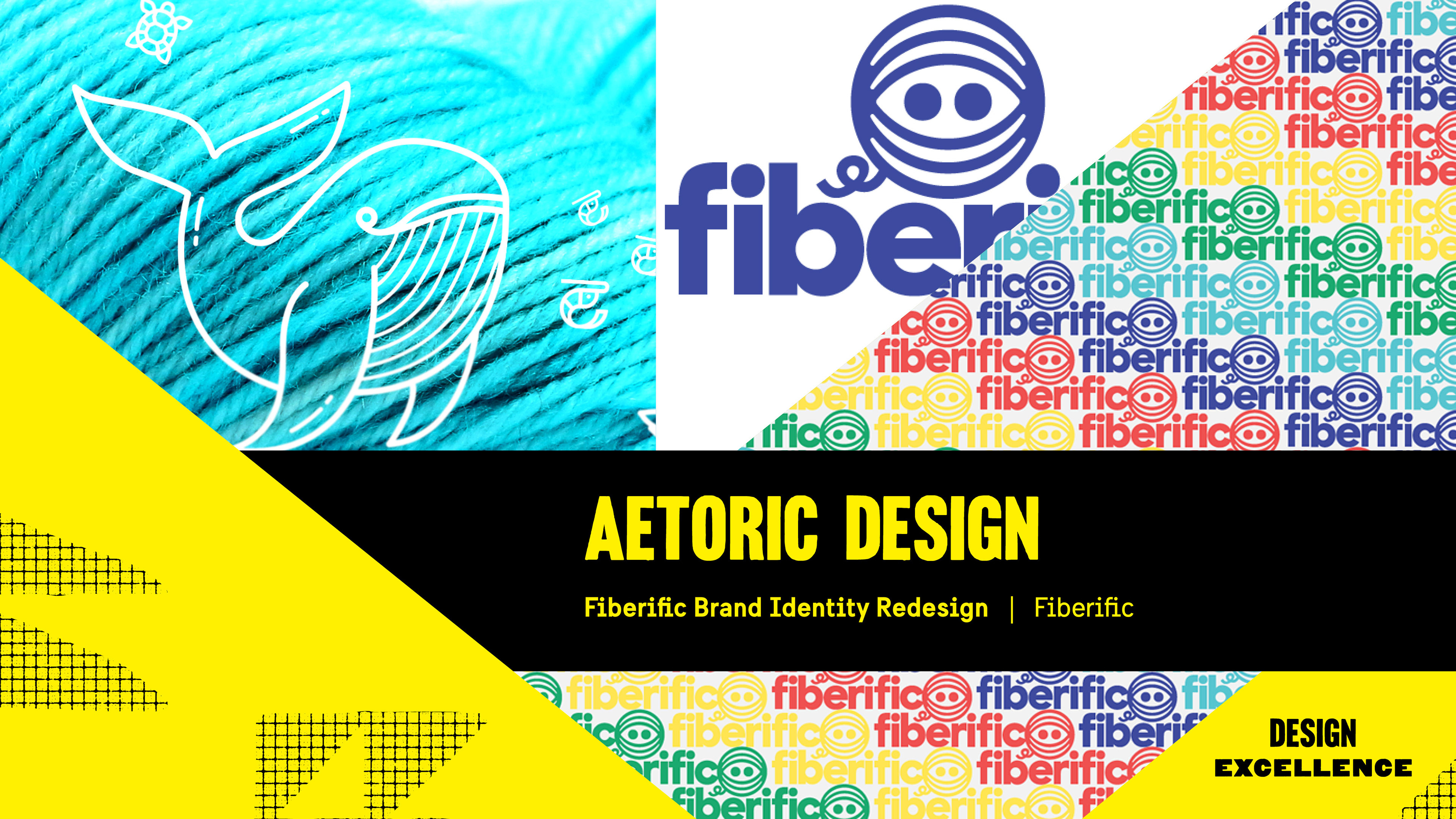
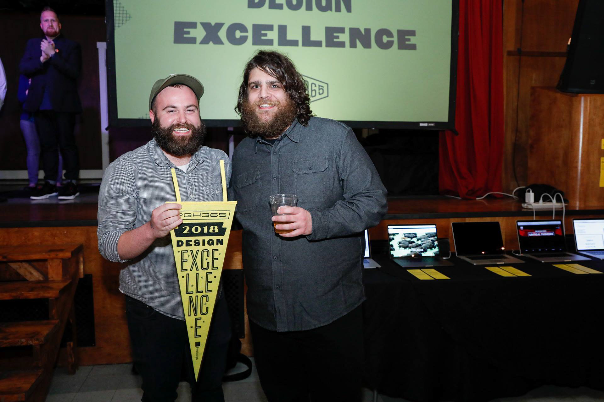
It was an absolutely honor to be recognized by AIGA Pittsburgh during their annual PGH365 competition for Design Excellence. We wish Fiberific could have been there to accept it with us, but travel logistics from Australia proved insurmountable!
Could you tell I was sweating it? Cheers!
Could you tell I was sweating it? Cheers!
Thanks.